Relopay
A mobile-first FinTech platform for managing USDT balance, issuing payment cards, and tracking financial activity in one secure experience.

Overview
Relopay is a mobile-first financial platform that allows users to manage their USDT balance, access physical and virtual payment cards, review transactions, complete identity verification, and top up their account through supported crypto exchanges.
The product brings several complex financial processes into one interface: social authorization, profile setup, KYC, card management, protected card details, transaction history, card issuance, and crypto-based account funding.
My goal was to turn these processes into a clear and predictable mobile experience where users always understand their current status, available actions, and next steps.
Role
I worked on Relopay as a Product Designer and covered the complete product-design process. My responsibilities included: competitor and market research, product structure, UX architecture, user-flow mapping, key scenario definition, wireframes, mobile UI design, interaction states, error, loading, and empty states, reusable components, responsive behavior, preparing screens and logic for development.
The challenge
The challenge was to make complex FinTech workflows feel simple without hiding information that affects user trust or financial decisions.
The core product question was:
How can we help users manage digital funds and payment cards confidently while keeping every sensitive process clear, secure, and predictable?
Research and competitor analysis
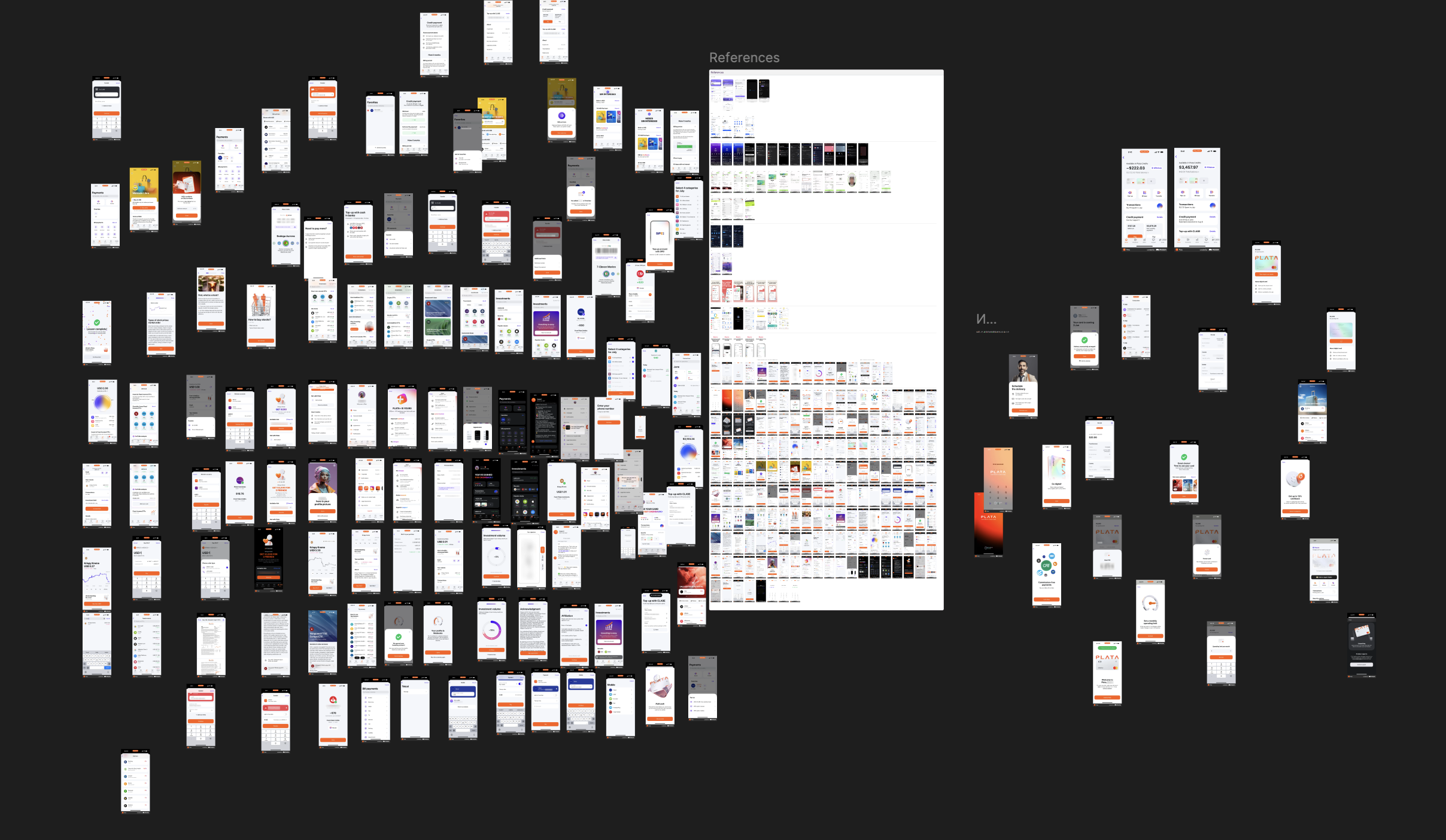
Before defining the product structure, I studied a wide range of FinTech, banking, crypto, and card-management products. Instead of focusing only on visual references, I compared how different products explained complex states and guided users through restricted financial actions. The competitor analysis helped identify several recurring problems:
- users often do not understand why an action is unavailable;
- KYC is frequently disconnected from the action that requires it;
- card details can be either overexposed or unnecessarily difficult to access;
- transaction statuses are not always explained clearly;
- loading and failure states are often treated as secondary cases;
- financial dashboards can show too much information without clear prioritization.
Target audience
The main users are people who manage digital funds and need a practical way to use those funds through physical or virtual payment cards.
UX Flow
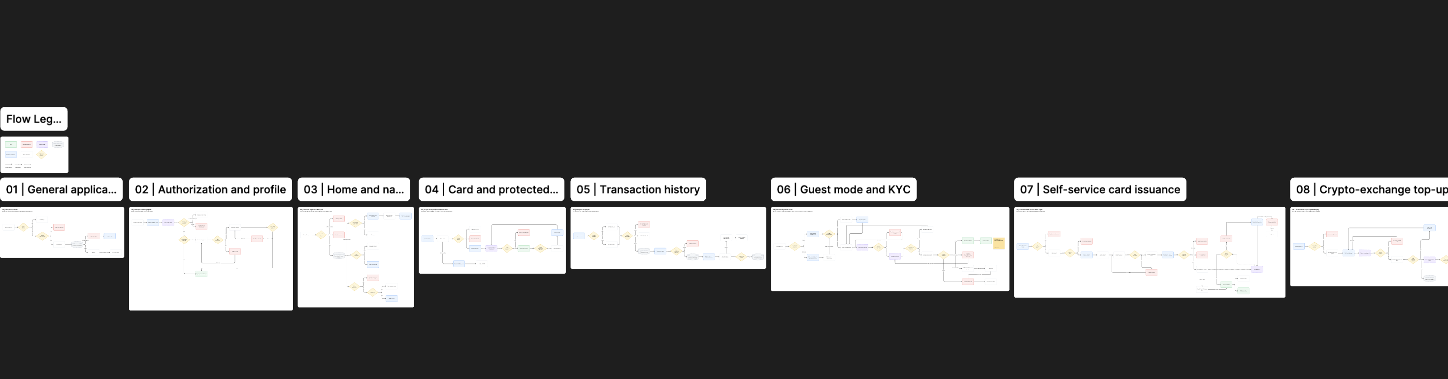
I mapped the product as a set of connected scenarios rather than designing screens independently. The final UX flow covered eight major areas:
- General application flow
- Authorization and profile
- Home and navigation
- Card and protected details
- Transaction history
- Guest mode and KYC
- Self-service card issuance
- Crypto-exchange top-up
Wireframes
After defining the product flows, I created wireframes for the key scenarios.
The purpose of this stage was to validate structure and priority before investing time in visual styling. Several home-screen directions were explored. The later version improved the hierarchy by making balance, primary actions, cards, referral content, and transaction history easier to scan.
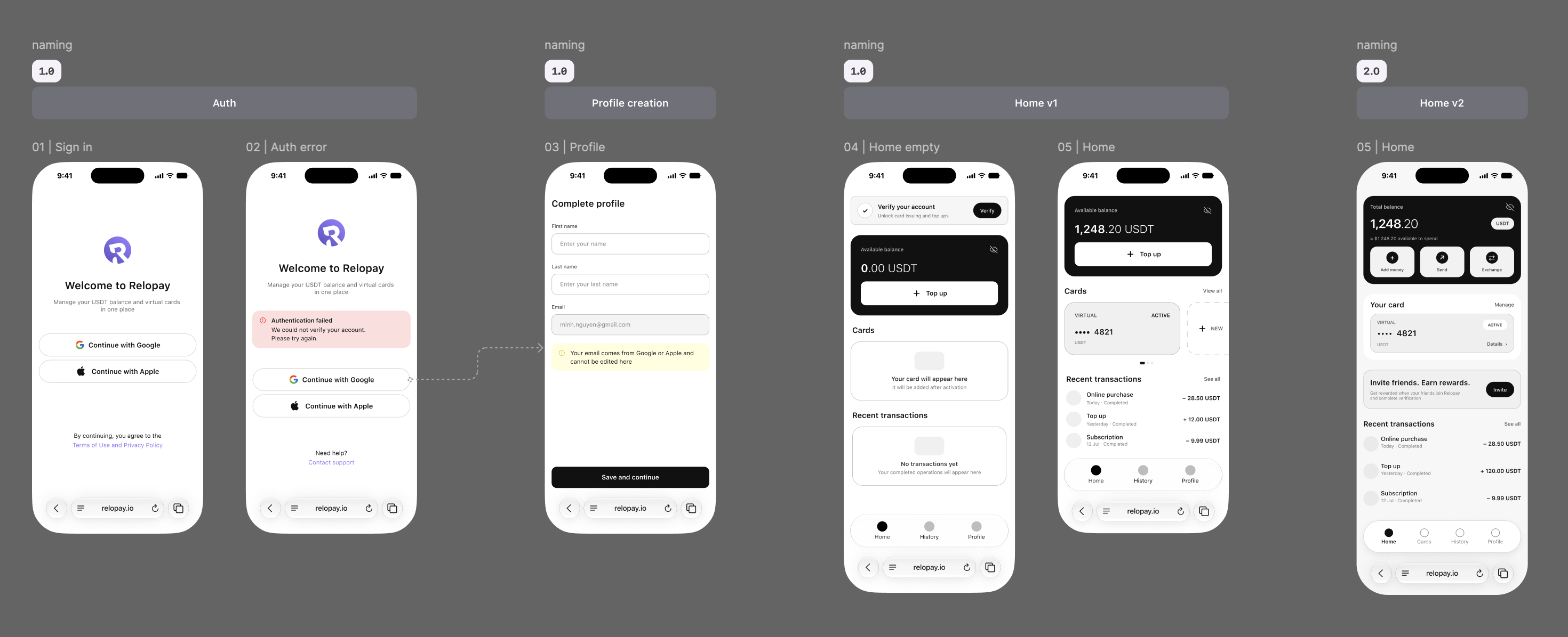
Main product areas
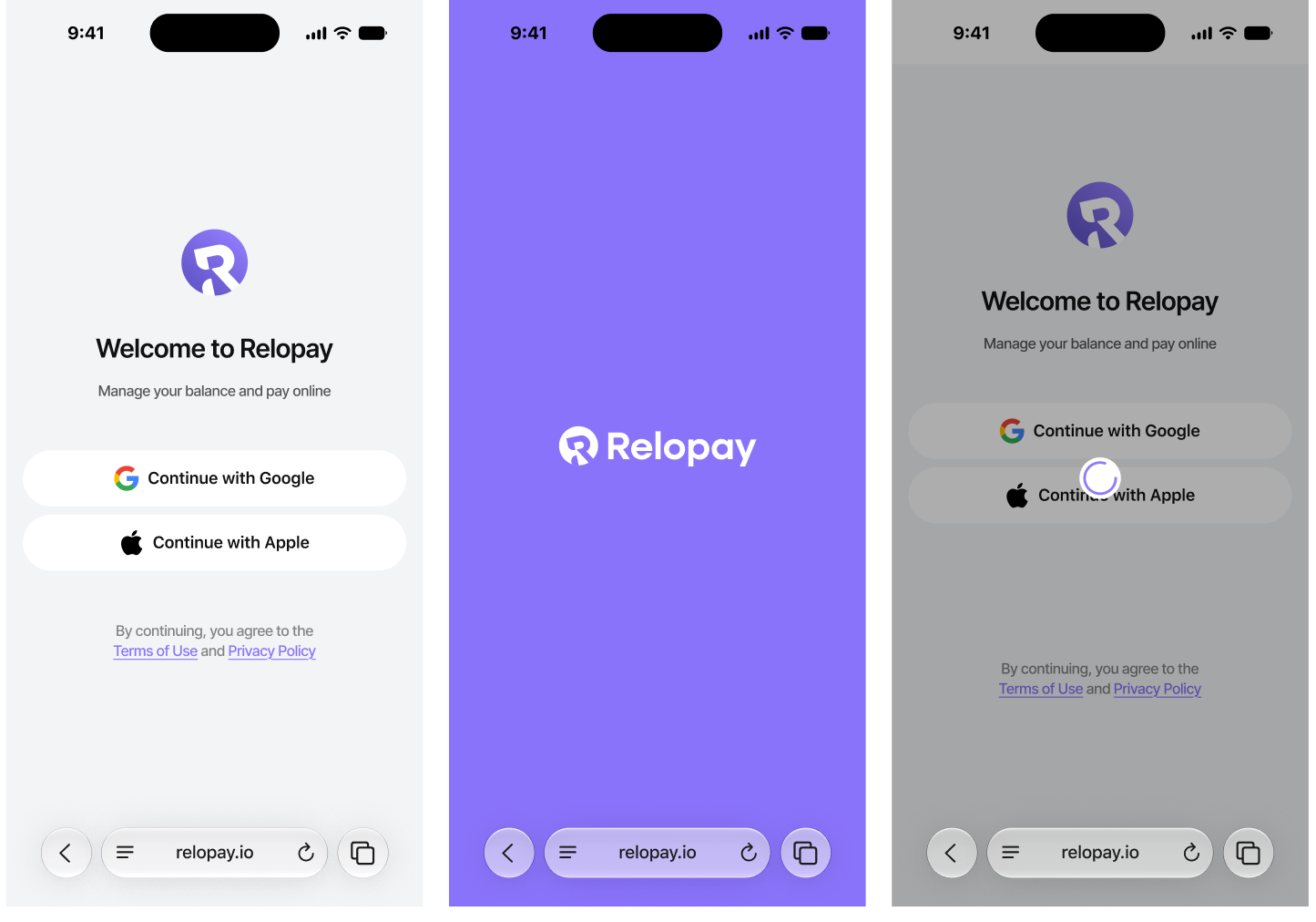
Authorization
The authorization experience uses familiar Google and Apple sign-in methods.
The flow includes loading, external authorization, connection failure, validation errors, and successful transition into profile setup or the main product.
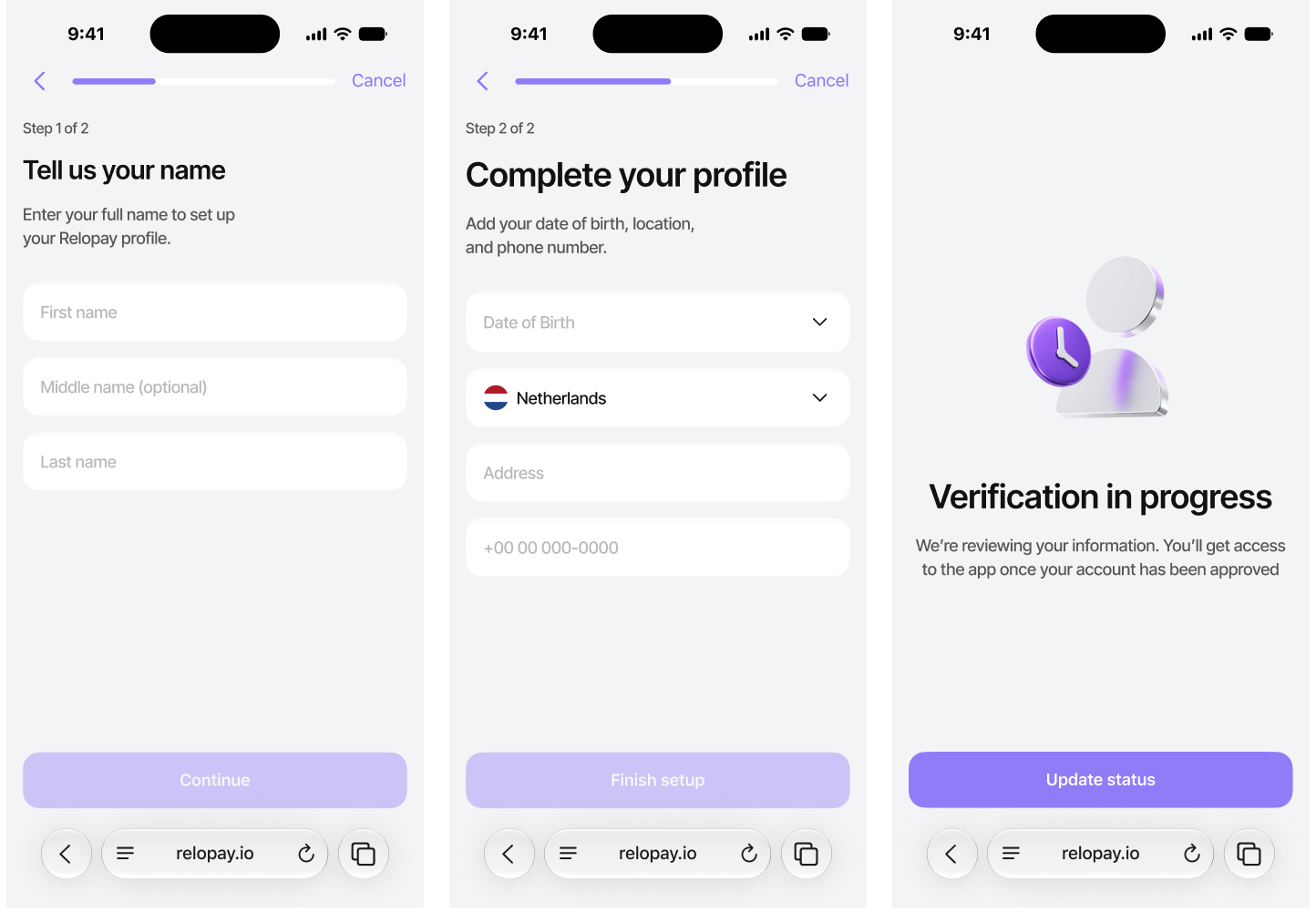
Profile completion
First-time users complete their basic profile through a short staged form.
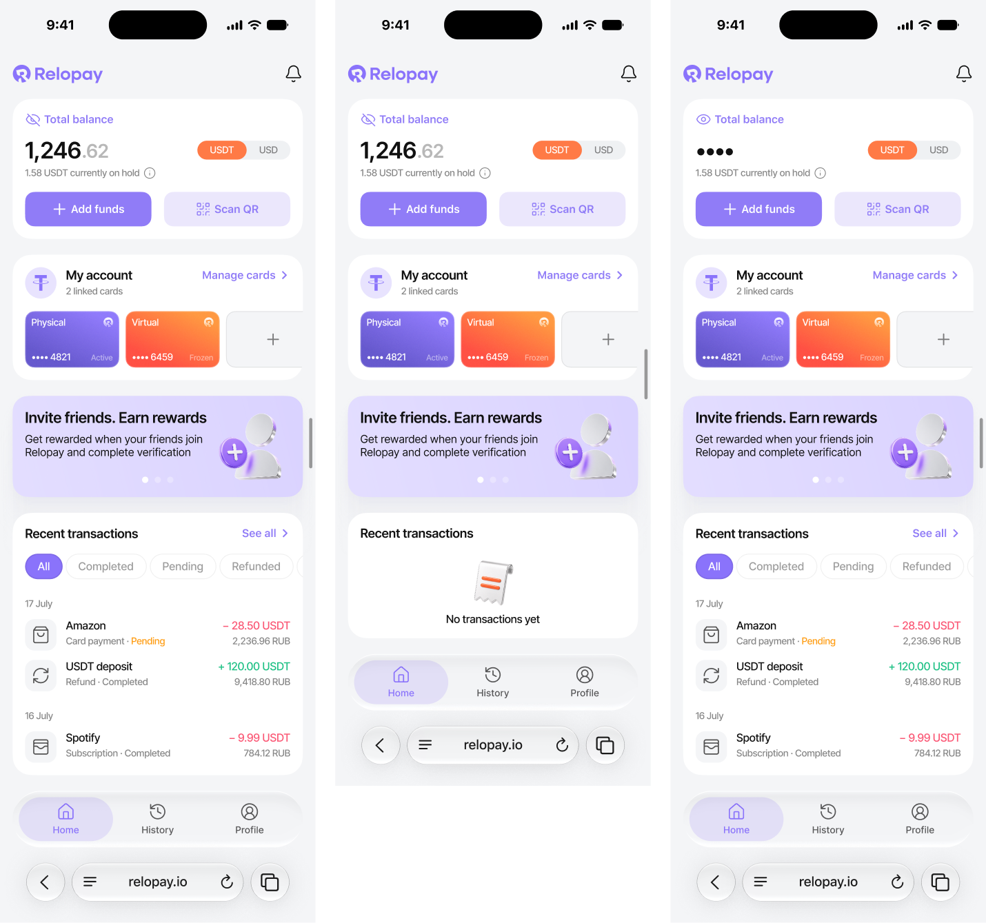
Home
The Home screen acts as the primary overview of the account.
Card management
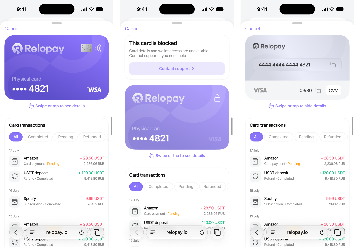
Users can review their linked physical and virtual cards and access card-specific details.
Transaction history
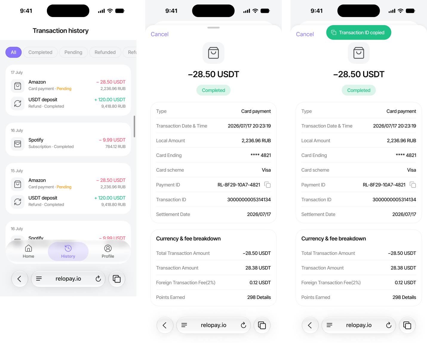
Transaction history is structured by date and can be filtered by operation status.
Top Up Balance
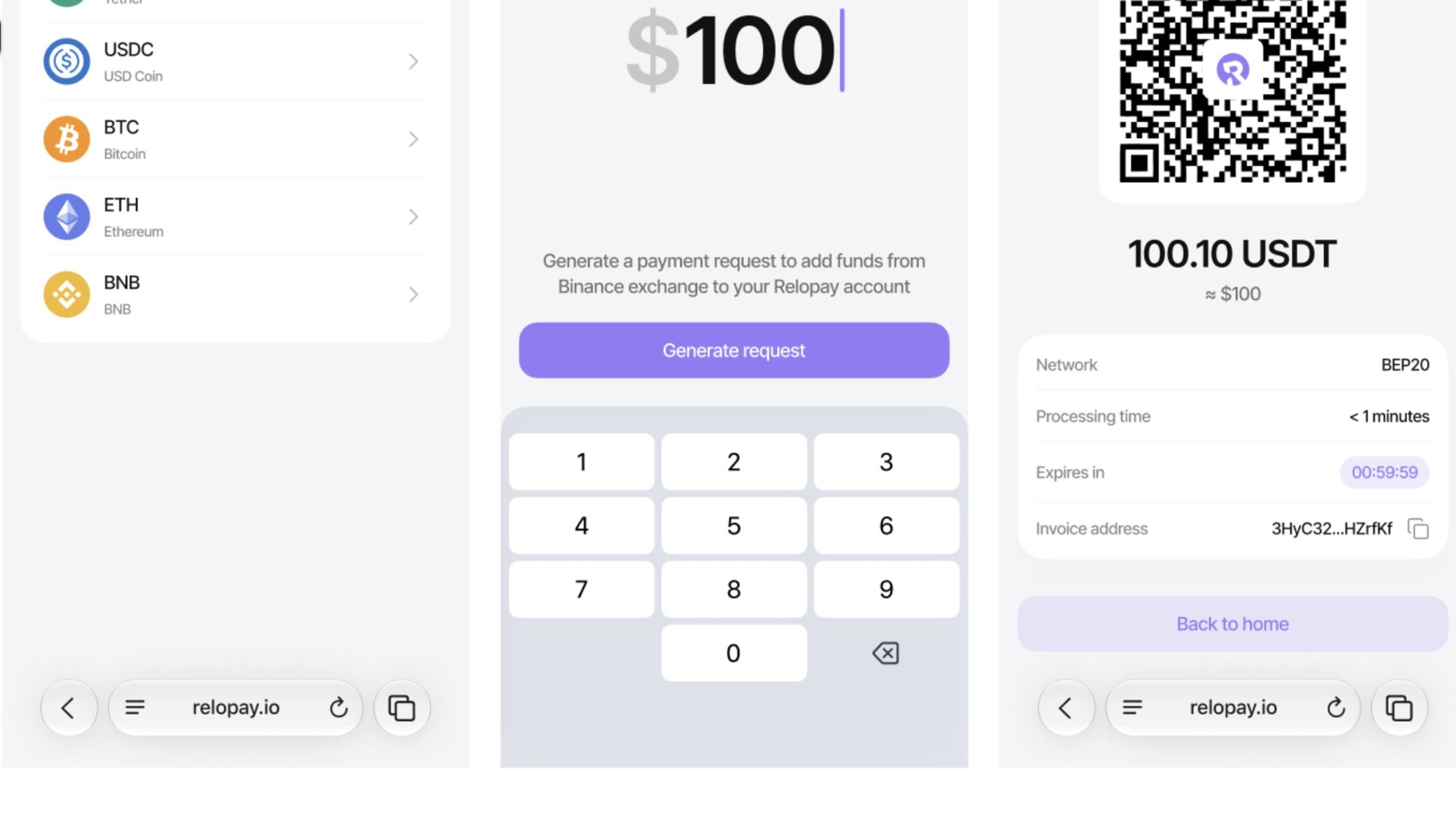
Users can top up their balance through a crypto exchange by selecting a cryptocurrency, network, and exchange, then entering the desired amount. The flow ends with an invoice and QR code that can be used to complete the transfer from the selected exchange.
Self-Service Card Issuance
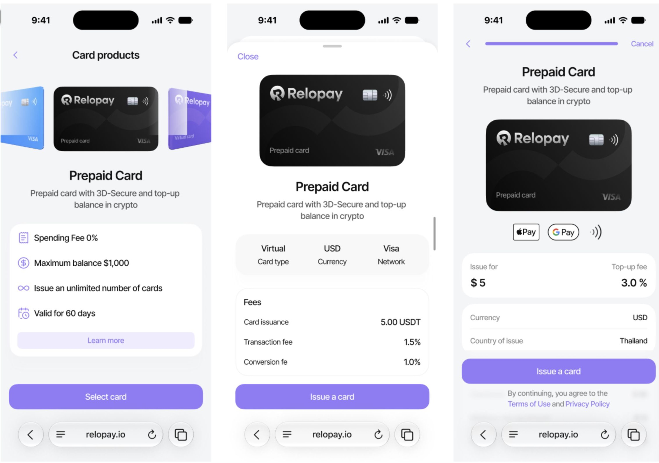
Users can choose a card from a horizontally scrollable catalog, review its details in an expanded bottom sheet, and complete the order through checkout. The full issuance flow also includes entering a billing address before confirmation.
Light & Dark Themes
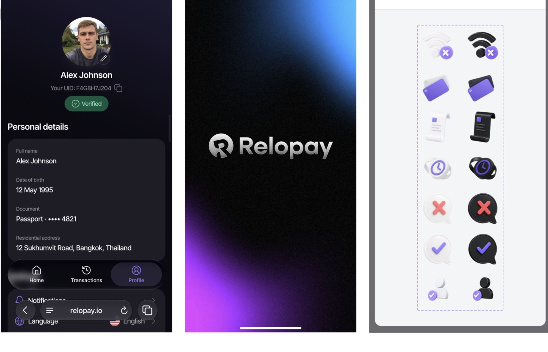
I also designed a complete dark theme across all key product screens. Each illustration was adapted for both light and dark interfaces to maintain clarity, contrast, and visual consistency in either mode.
Design System
I built a scalable design system with reusable components and structured design tokens. The system supports seamless switching between light and dark themes while maintaining consistency across all product screens.
Relopay Design System
Color Palette
Primary
#8974F5
Primary soft
#EEEAFE
Ink
#15131E
Surface
#F5F5F8
Success
#2E9B6F
Danger
#E85D5D
Typography
Heading / 32
Secure finances
Body / 16
Balance and card activity
Caption / 12
Updated just now
Spacing & Radius
Buttons & Status
Inputs
Bank Cards
Prepaid card
•••• 4821
Virtual card
•••• 4821
Transaction Row
Success Metrics
Prototype validation showed that users could complete the main financial tasks with limited guidance, while contextual status explanations reduced confusion around verification, cards, and transactions.
Core task completion
88%Most participants completed the main balance, card, and transaction tasks without assistance.
Time to find card details
-31%Protected card information became faster to access while remaining hidden by default.
Transaction-detail completion
92%Users successfully opened a transaction and found its status, local amount, and identifier.
Profile completion rate
84%The staged profile form reduced abandonment during first-time setup.
Error recovery rate
79%Users successfully recovered from failed authorization, loading, and invoice states.
Prototype usability score
82/100The tested experience was perceived as clear and manageable despite complex financial workflows.
Outcome
The final design turned a complex collection of financial processes into one connected mobile experience.
The combination of competitor research, detailed UX flows, wireframes, final UI, and reusable components created a product structure that was ready for development and future expansion.
Reflection
Relopay reinforced the importance of designing FinTech products around states, not only screens.
A financial interface may look simple in its default condition, but the complete experience also includes expired sessions, failed providers, blocked cards, pending transactions, verification restrictions, missing data, and long-running operations.