
Pivex
A funded trading platform that helps traders manage accounts, track performance, understand objectives, and access key trading tools across desktop and mobile.
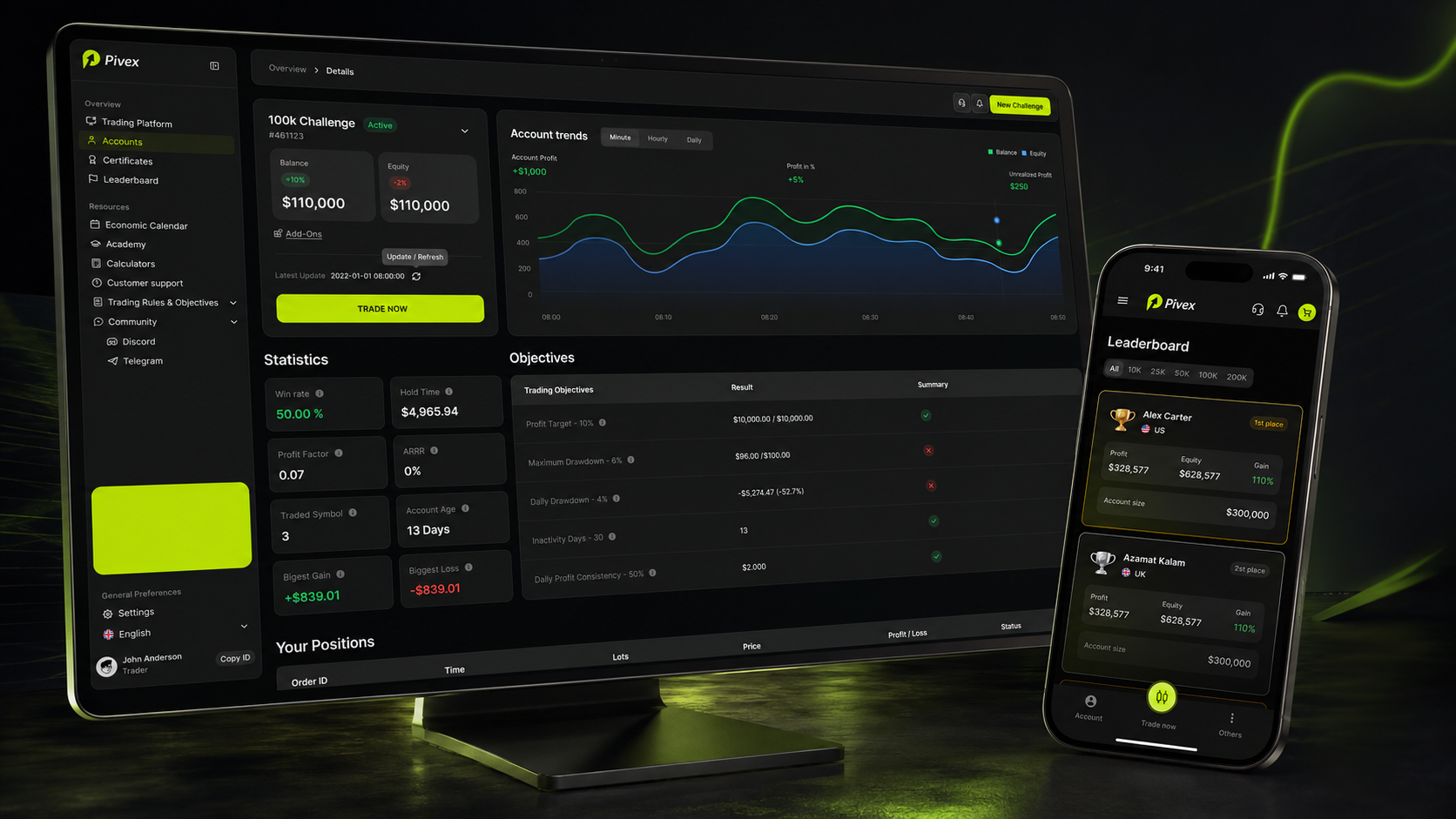
Overview
Pivex is a funded trading platform designed for traders who need a clear, reliable, and structured way to manage their trading journey.
The platform brings together everything a trader needs in one ecosystem: account management, trading terminal, account objectives, performance analytics, withdrawal flow, certificates, leaderboard, economic calendar, academy, calculators, notifications, and profile settings.
The main goal was to make a complex trading product easier to understand and operate. Traders work with sensitive financial data, strict rules, and time-sensitive actions, so the interface needed to feel fast, transparent, and trustworthy.
Role
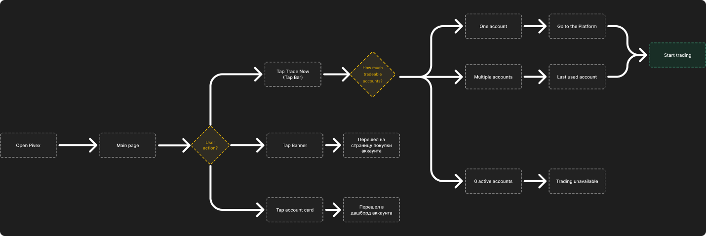
My role covered product structure, UX logic, user flows, desktop interface, mobile responsive adaptation, UI components, dashboard patterns, data-heavy tables, modals, forms, trading-related screens, and the overall visual system.
The challenge
The challenge was to design a trading platform that gives users full control over their funded account journey without overwhelming them with too much information.
Trading products contain many complex elements: balances, profit targets, drawdown rules, trading objectives, open positions, reports, payout eligibility, certificates, account upgrades, and market tools. If the interface is not structured well, traders can easily miss important information or misunderstand their current account status.
The core product question was: How can we make a funded trading platform feel clear, reliable, and easy to use while still supporting complex financial workflows?
Target audience
The main users are funded traders who use Pivex to manage their accounts, trade, track objectives, and monitor their progress.
The platform also supports beginner and growing traders through educational content, calculators, economic calendar, and support resources.

User context
Pivex is used in high-focus moments.
Traders open the platform when they want to check account status, trade, review objectives, monitor market data, request withdrawals, verify identity, or understand what action is needed next.
Main product areas
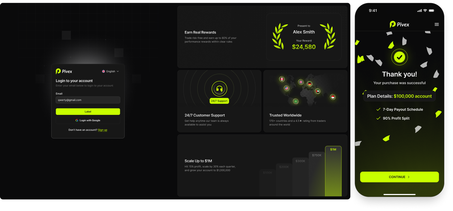
Login and success states
The project included login and purchase success states. These states helped complete the end-to-end product experience outside the main dashboard.
Accounts
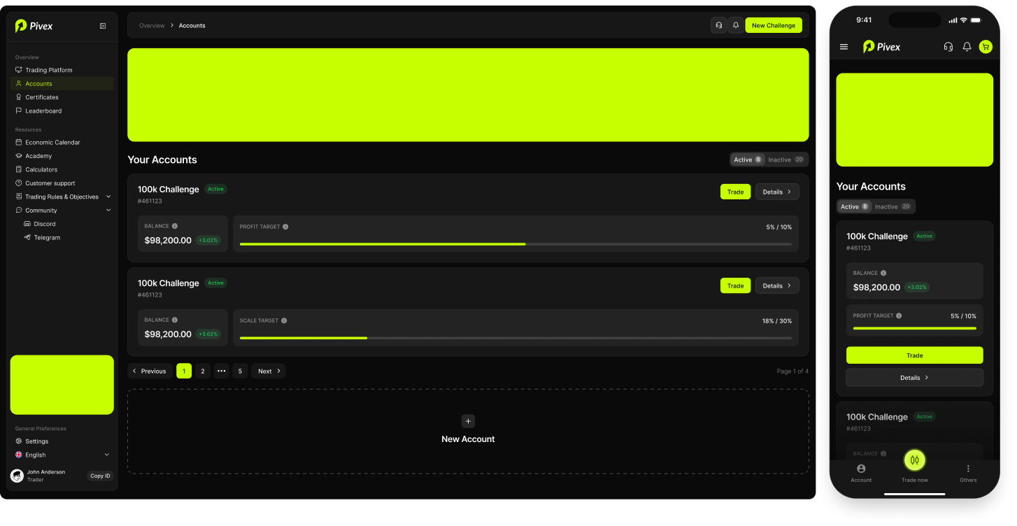
The accounts page gives traders a clear overview of their active and inactive trading accounts. The goal was to make the account list easy to scan. Traders should immediately understand which accounts are active, what progress has been made, and where to go next.
Trading platform
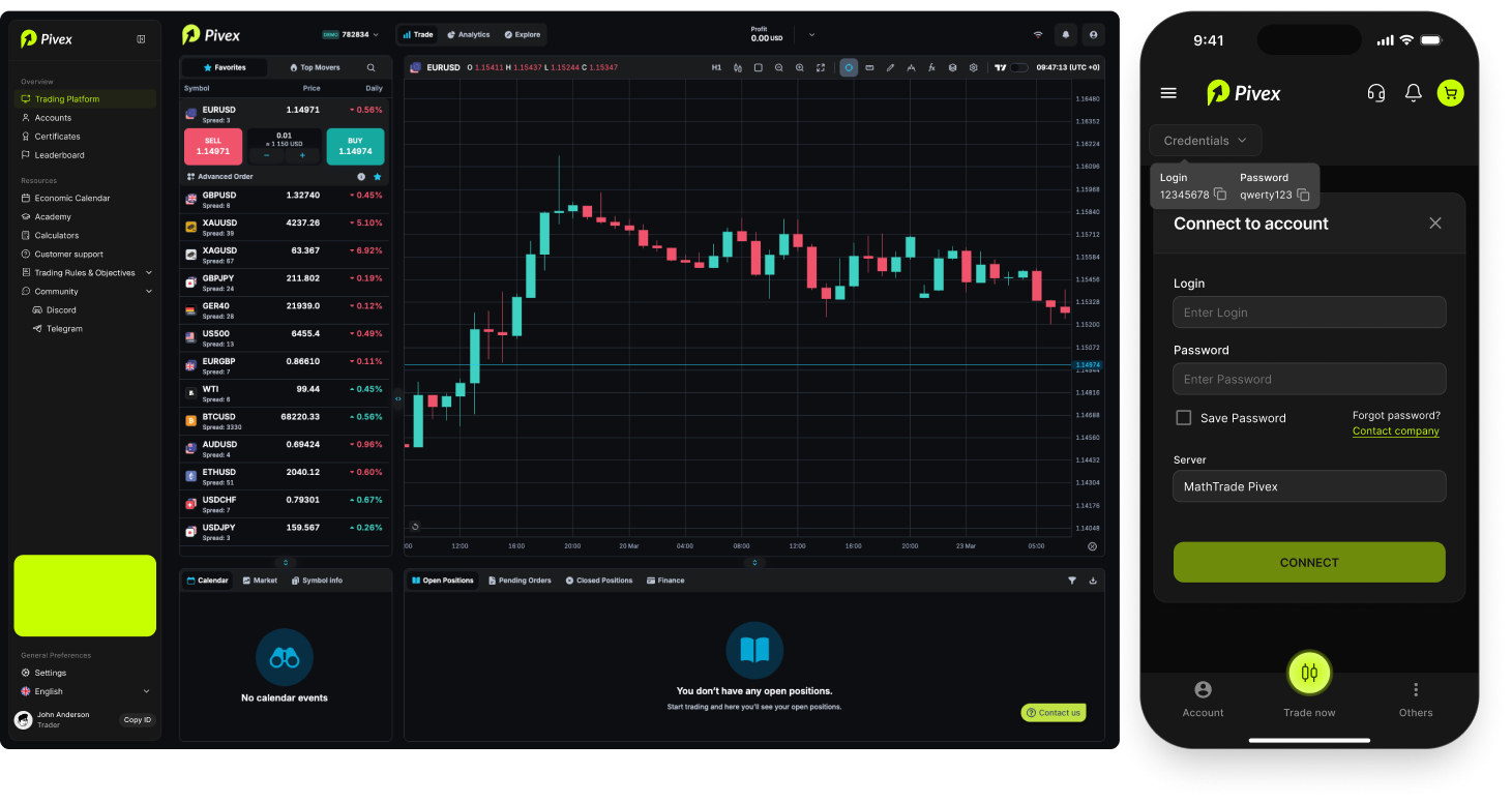
The trading platform is the core workspace for active trading. The design uses a dark interface, strong contrast, and clear status colors to match the expectations of a trading environment.
Account details
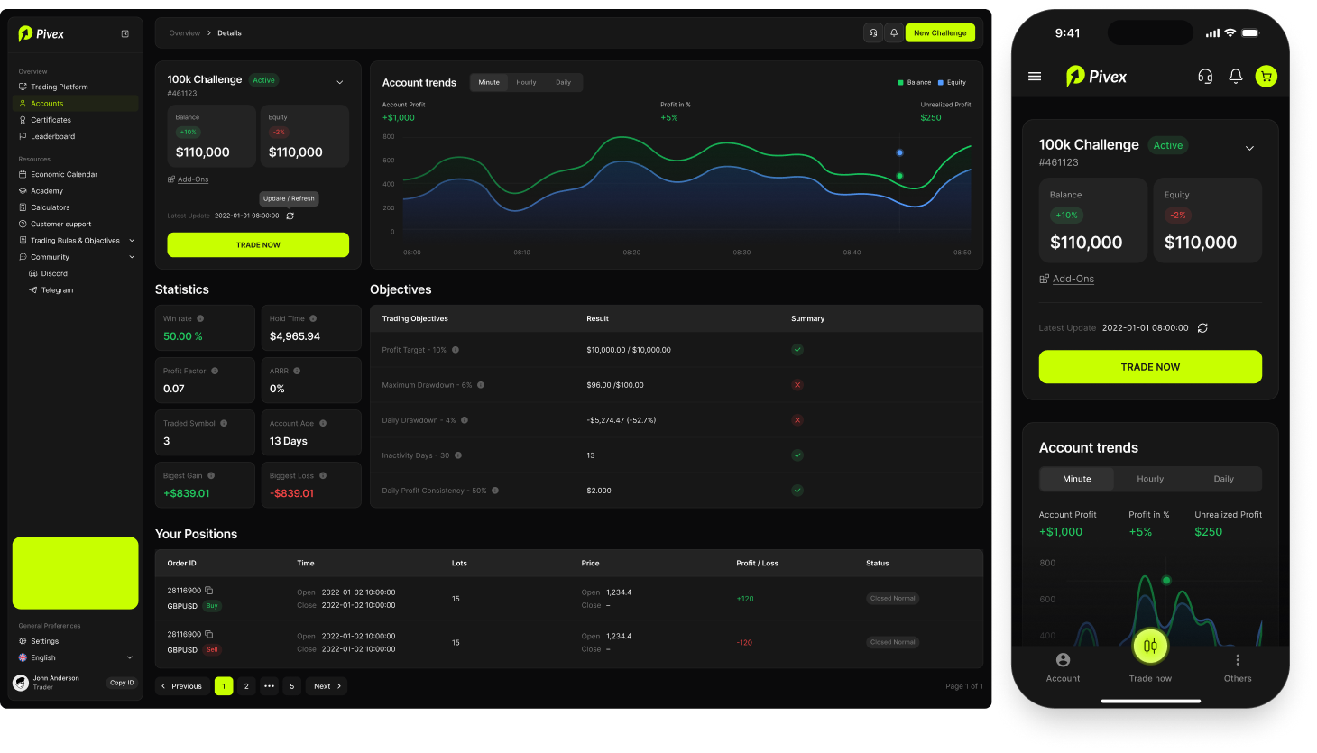
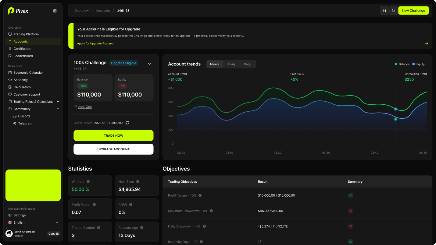
The account details page helps traders understand a specific account in depth. The most important part of this screen is clarity around objectives. Traders need to know which rules are passing, which are breached, and what numbers matter. The design uses structured tables, status indicators, and grouped metrics to make this information easier to read.
Withdrawal
The withdrawal flow allows eligible traders to request a payout and review withdrawal history. The main UX goal was to reduce uncertainty around payout eligibility and next steps.
Verification
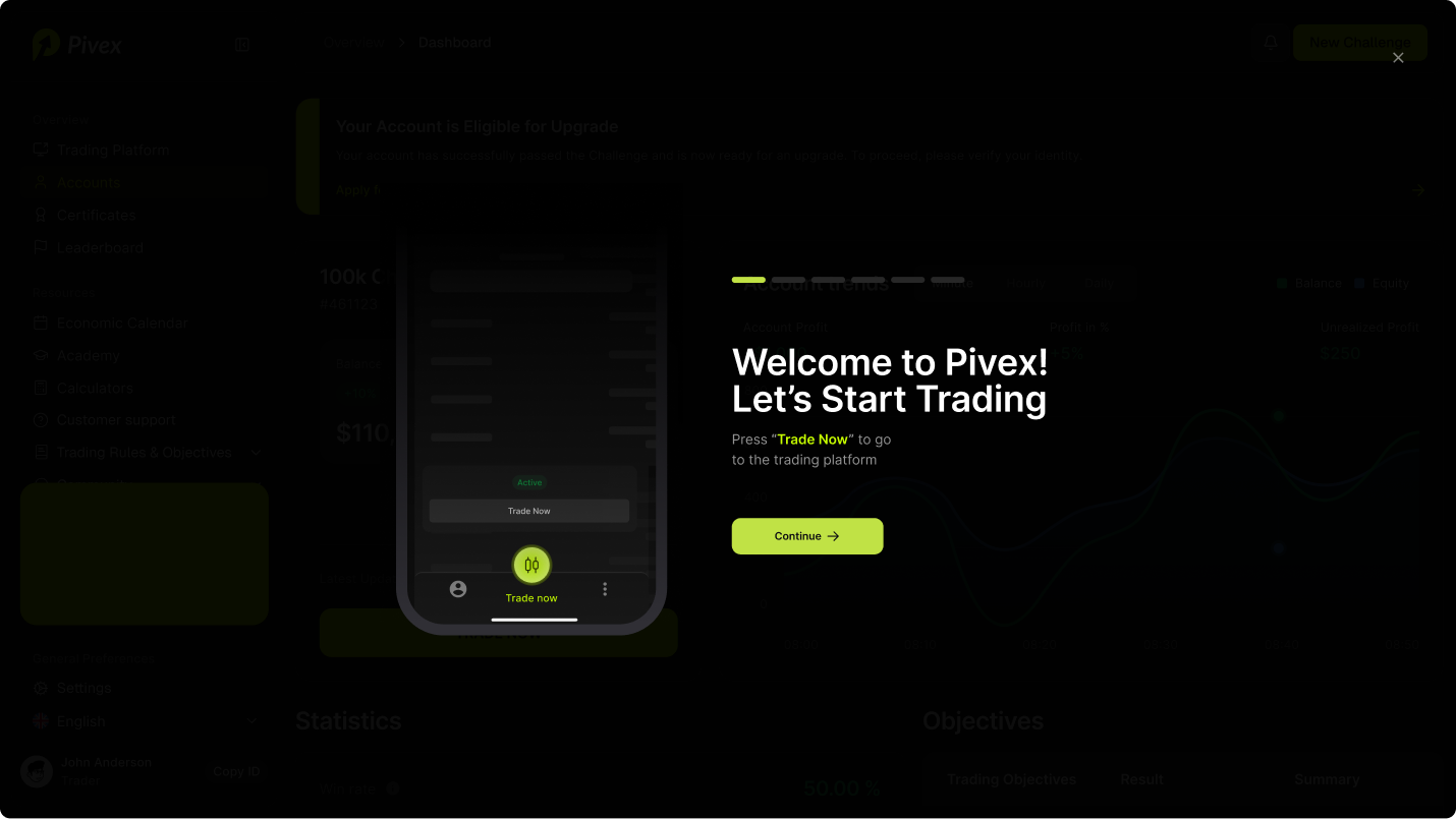
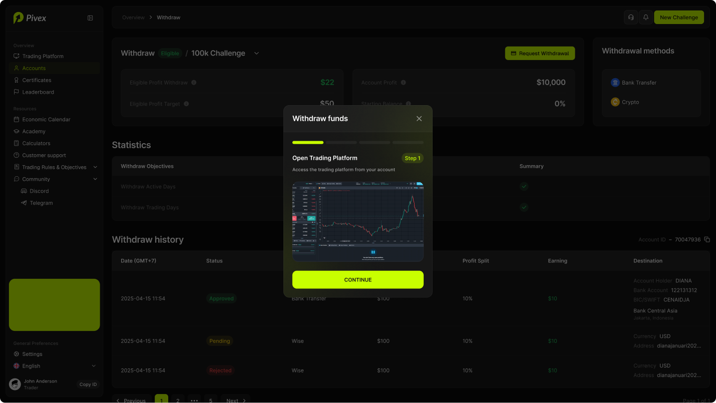
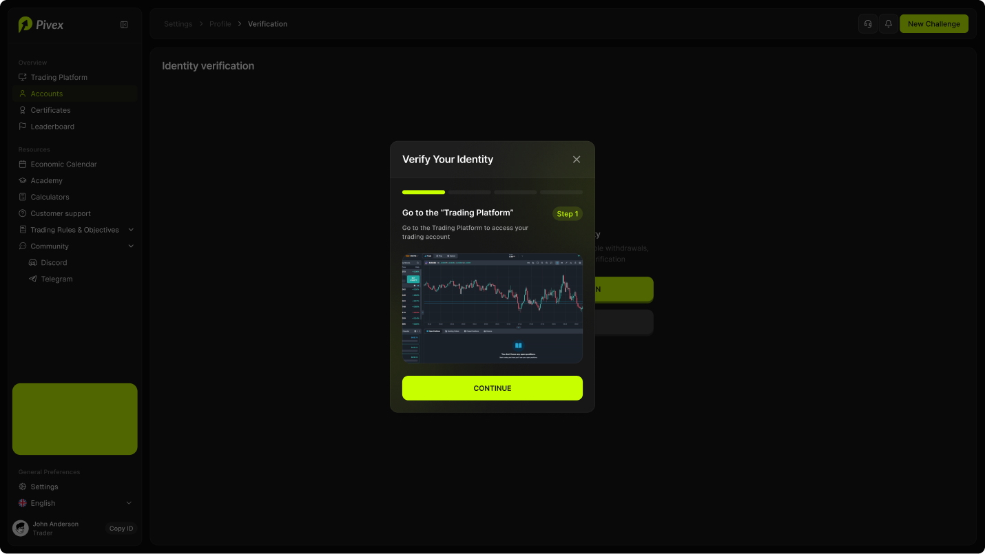
The identity verification flow is presented as a guided modal with progress steps. Instead of sending users to a separate unclear process, the modal explains what they need to do and why. The background is dimmed to focus attention on the current verification step. This flow is important because verification affects withdrawals, upgrades, and account safety.
Account upgrade
The upgrade flow appears when an account becomes eligible for the next stage. The design needed to make the upgrade process feel like a clear milestone, not a confusing administrative step.
Certificates
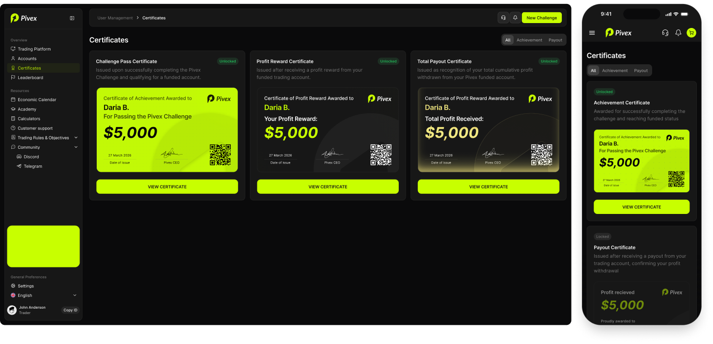
The certificates page provides recognition for important user achievements. This section adds credibility and gives traders a shareable proof of progress.
Leaderboard
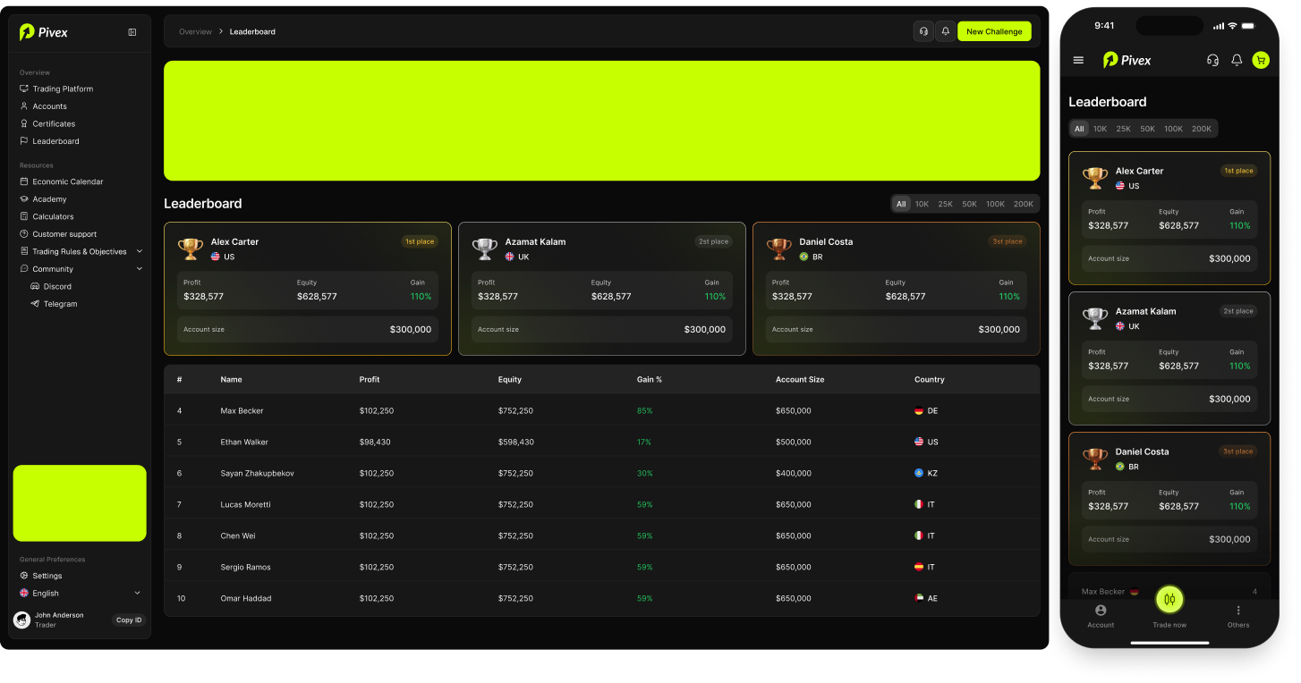
The goal was to create a competitive but professional view. The leaderboard should motivate users without making the interface feel like a game. It also helps show community activity and trader performance.
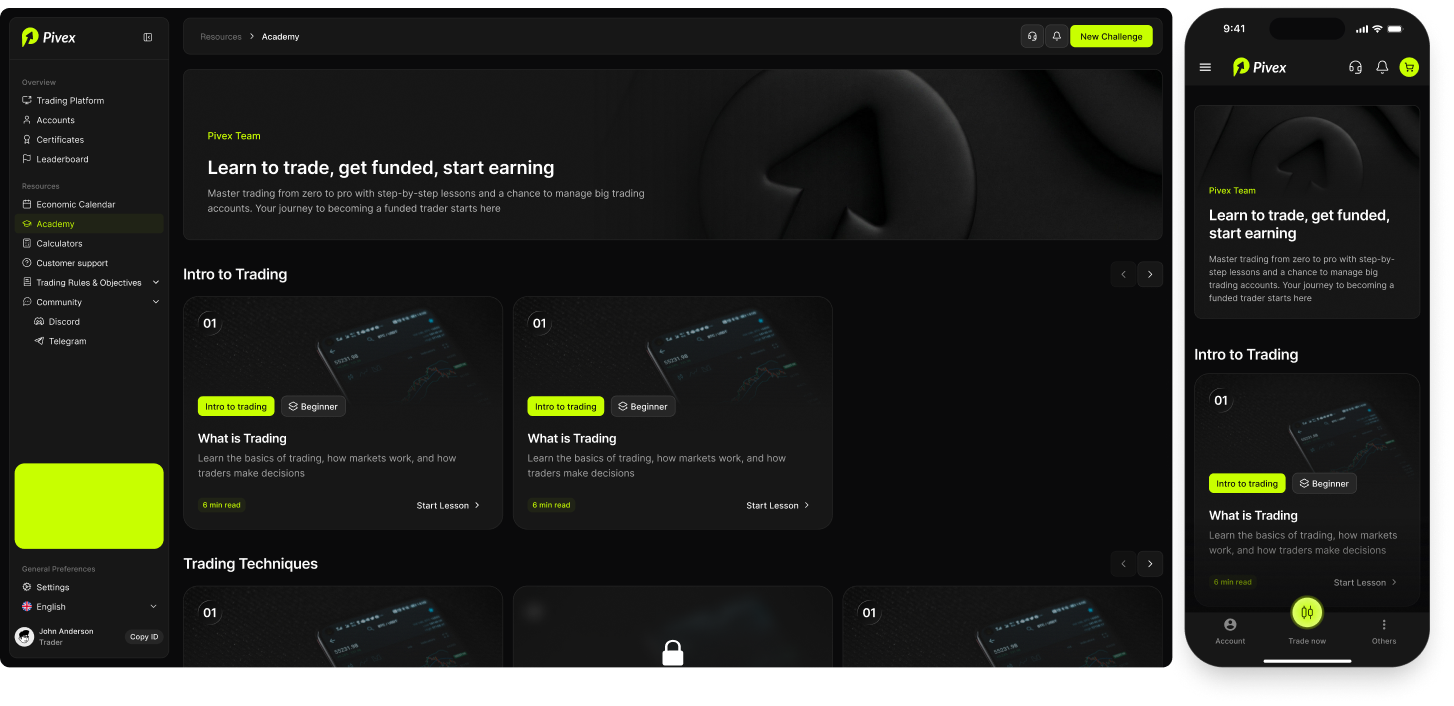
Academy
The academy section provides learning content for traders. This helps Pivex support not only experienced traders, but also users who want to improve their trading knowledge inside the same ecosystem.
Design system
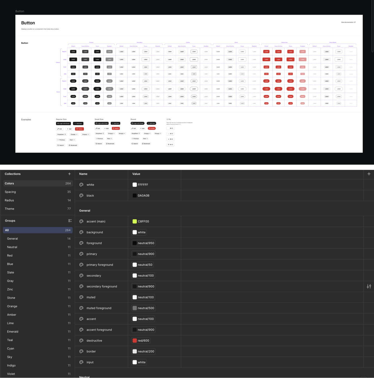
The system included: typography, color styles, sidebar navigation, top navigation, buttons, tabs, cards, forms, inputs, selects, tables, status pills, notification cards, modals, progress bars, chart containers, certificate cards, lesson cards, calculator components, responsive layouts, mobile components.
Success Metrics
The platform improved clarity and usability by making account status, objectives, payouts, and trading tools easier to access across desktop and mobile.
Account overview engagement
74%Shows that traders regularly used the accounts page to check account status and progress.
Trading platform usage
63%Indicates that the trading workspace became one of the main active areas of the product.
Time to find account status
-36%Shows that users could understand their current account state faster than before.
Objective tracking engagement
58%Confirms that traders actively checked rules, progress, and account conditions.
Withdrawal flow completion
81%Indicates that payout-related steps were clear enough for users to complete successfully.
Support questions about account status
-24%Suggests that clearer account pages reduced confusion and unnecessary support requests.
Mobile usage share
47%Confirms that the responsive version was important for quick checks outside desktop.
Notification action rate
29%Shows that notifications helped users take relevant actions inside the platform.
Calculator usage
38%Indicates that trading tools were used as part of the decision-making workflow.
Academy content engagement
42%Shows that educational content supported users beyond the core trading dashboard.
Outcome
The final design created a full trading platform ecosystem for Pivex. The product included account management, trading terminal, account analytics, objectives, certificates, leaderboard, economic calendar, academy, calculators, withdrawal, verification, upgrade flow, notifications, profile settings, email templates, login, and success states.
The platform became more than a set of disconnected trading screens. It was structured as a complete user environment where traders can understand their current status, take action, track progress, learn, and manage financial flows.
Reflection
This project helped me work with a complex FinTech product where clarity, trust, and structure were the most important design goals.
The main design challenge was balancing density and usability. Trading platforms need to show a lot of information, but users still need to understand what matters immediately.
The biggest learning was that good UX in financial products is about reducing uncertainty. Traders need to know where they are, what changed, what risk exists, and what action they can take next.
Pivex required a design system that could support dashboards, tables, forms, modals, financial flows, educational content, and responsive layouts while keeping the product visually consistent and easy to use.